

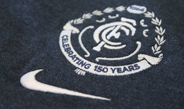
The Carlton Football Club has today released its official 2014 logo to mark the 150th year of its hallowed existence, drawing on key elements in the design as it has evolved over the decades.
The logo, some 12 months in the making, takes its inspiration from four of its most successful eras – the 1960s, ’70s, ’80s and ’90s - during which time Carlton landed eight of its 16 Premierships.
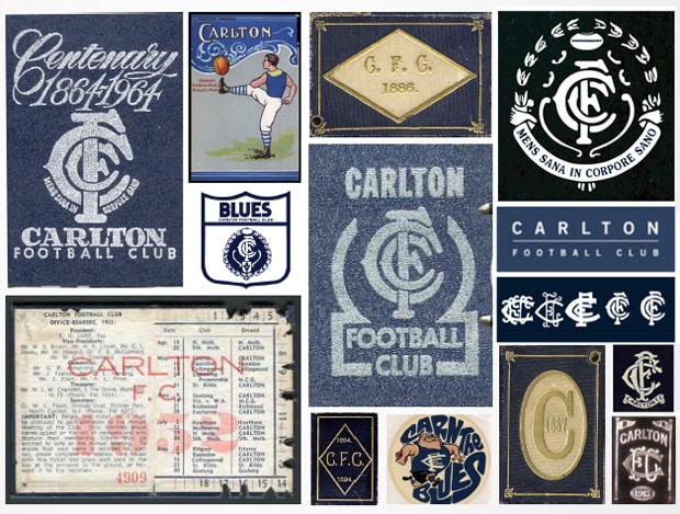
The famous white CFC monogram remains and is appropriately central to the overall design. Below it is a white ribbon upon which the words “CELEBRATING 150 YEARS” are emblazoned in dark Navy Blue.
Above it, in silver tone, is a laurel wreath topped by a football into which its foundation year - “1864” - appears for the first time.
In keeping with club tradition, Carlton has also adopted the time-honoured “We Are The Navy Blues” slogan for 2014, replacing the “I Am Carlton” catchphrase.
Carlton Chief Executive Officer Greg Swann said that designers of the 150th logo had found the right balance in respecting the club’s past with the now.
“At the conclusion of the 2012 season we engaged our on-field apparel partner Nike, as well as AFL Media, to work in with our brand team in sourcing options for a crest to celebrate what will be a fantastic milestone in the history of the Carlton Football Club,” Swann said.
“The team looked at all logos of every era in coming up with the final design, and at the very end called on creative agency Ogilvy to bestow some finishing touches. The monogram remains as is, but the wreath, which was prominent through what was arguably Carlton’s most successful eras, returns.”
Swann explained that Nike was able to draw on its previous experiences with global sporting teams that had also reached significant milestones to help deliver an appropriate brief to AFL Media.
“The brief was to respect the past, but very much celebrate the milestone right now – and we believe we’ve got that with the end product,” he said.
From today, the logo will feature on all branding central to Carlton’s 2014 campaign.
It will also appear on all club on-field apparel – including the 2014 home and away match day guernsey (above the number on the back) – and the polo shirt to be worn by each member of the playing group and coaching staff.
Players, staffers and Members of the Carlton Board will also sport a numbered lapel pin featuring the logo to complement their matchday uniform. Only 150 copies of the pin are to be minted, with Andrew Walker inheriting pin No.1 and Troy Menzel No.2 etc., through to staff and Board Members.
In addition, a special 150th heritage guernsey, to be worn by the senior team into each of Carlton’s matches with Collingwood, Essendon and Richmond through next season, will also be released in February and available on retail prior to Carlton’s Family Day.
Swann envisaged that the number “1864” would remain a permanent fixture on the back of the famous dark Navy Blue guernsey beyond 2014. He added that today’s logo release was the first of a series of initiatives taken by the club to acknowledge its 150th anniversary.
As he said: “We are a very proud club, we have a rich history and we want to ensure we celebrate and showcase that with everyone connected with Carlton both here and around the world”.
The launch of the Club’s 150th logo also coincided with the launch of the Club’s 2014 Membership campaign. The Club is focused on building on the 50,000 strong membership base achieved for the first time this year.
